User Testing
Methodology
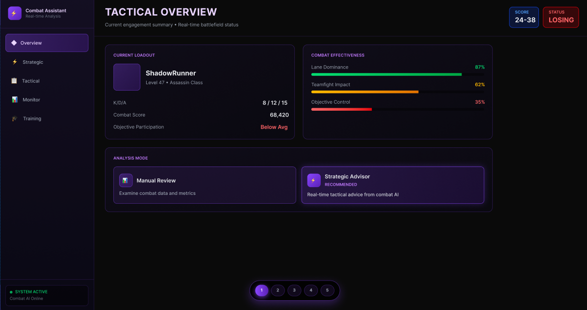
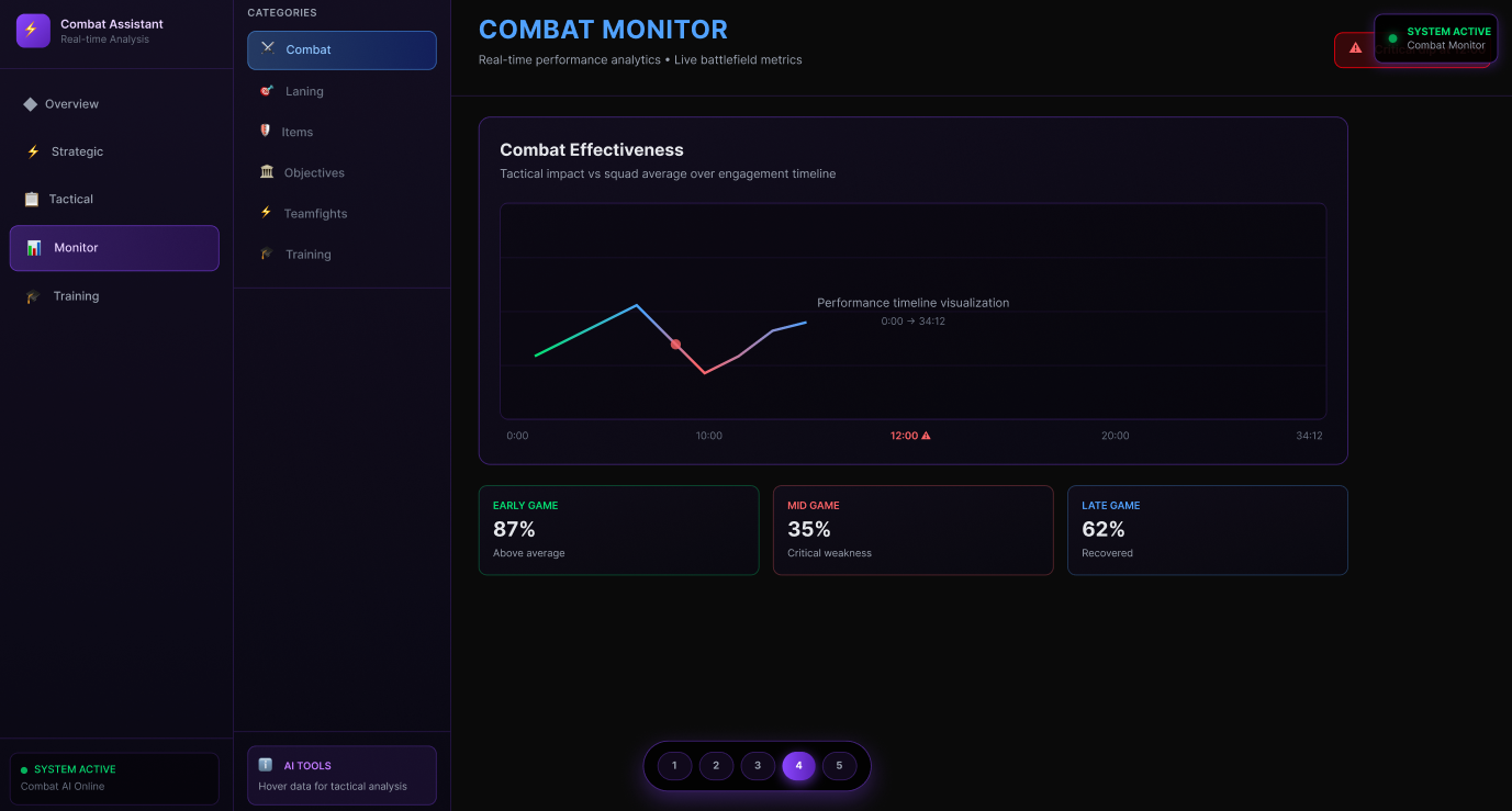
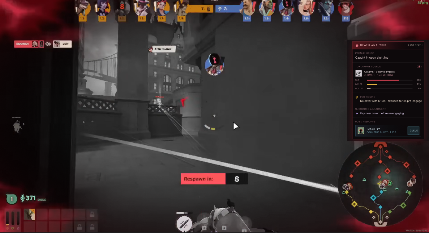
After building our high-fidelity Figma prototypes, we returned to the same two participants, Kenny and Jeremy, and ran informal remote user testing sessions over Zoom screen share. We showed each participant two distinct prototype flows: a post-game analytics flow focused on AI-driven recommendations and training drills, and an in-game analytics flow designed as a real-time tactical assistant.
We started each session by asking for first impressions without any prompting. Then we walked participants through specific tasks: finding a key weakness from the match, generating AI recommendations, understanding why a recommendation was made, and locating a training drill from that recommendation. Finally, we asked them to compare both flows directly.
Because Kenny and Jeremy were also our original interview participants, they gave us the unusual advantage of being able to compare what they said in research to how they actually behaved with a prototype in front of them.
What Kenny Responded To
Kenny understood the post-game prototype immediately and responded well to the AI Insights screen, specifically because it surfaced the Damage by Type chart, which he already trusts, as supporting evidence for the AI recommendations. That design decision paid off. Making the analytics he already valued feel like proof rather than extra noise was the right call.
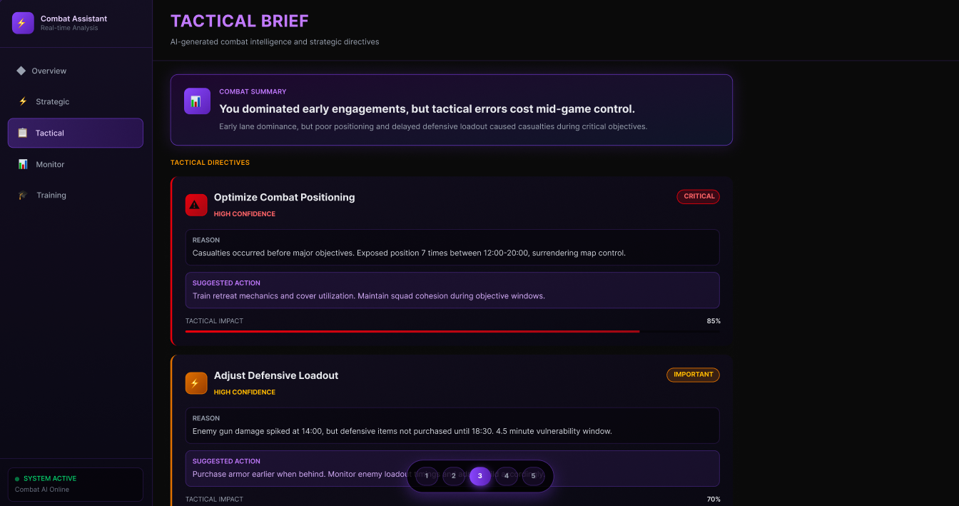
He responded more strongly to the in-game prototype overall. The Tactical Brief screen, which described the match situation with language like "You dominated early engagements, but tactical errors cost mid-game control," felt more useful to him than a stat breakdown. His main critique was visual: the UI felt too much like a separate dashboard rather than something embedded inside Deadlock's world. He suggested placing the interface over a blurred in-game background to make it feel like an overlay rather than a standalone app.
What Jeremy Responded To
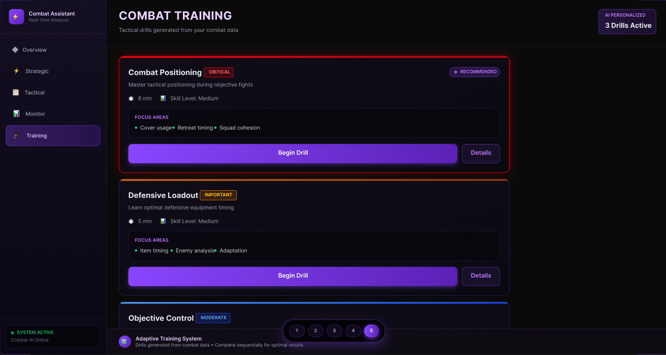
Jeremy's most positive reaction was to the Recommended Training screen in the post-game flow. In our earlier interview, he had specifically asked for analytics that connected to things he could actually do differently. Seeing a drill card with a severity tag, time estimate, and "Start Training" button built from the exact weaknesses found in his match, which addressed that directly.
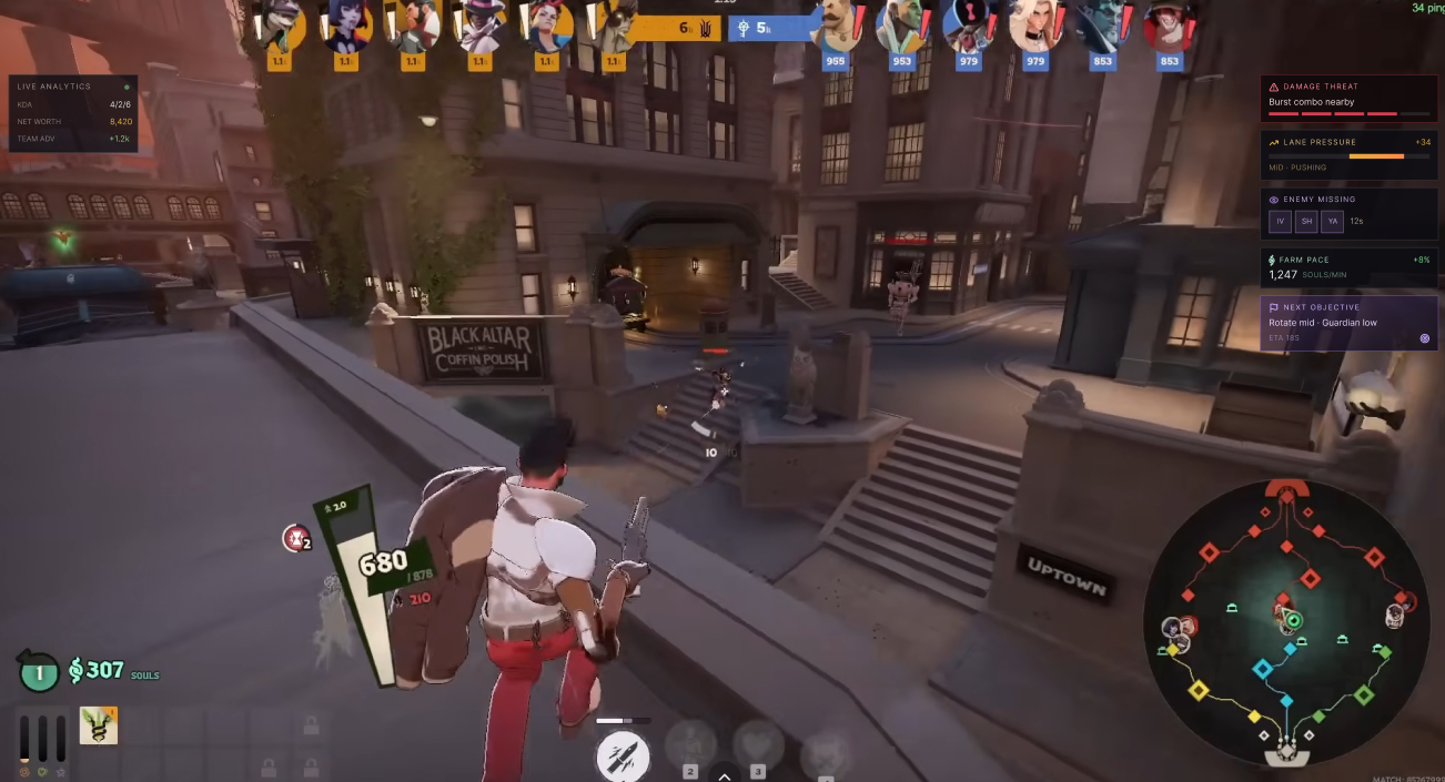
Jeremy raised the most useful structural critique of the session. On the in-game screens, he kept asking: "When would this actually show up?" He said the full-screen tactical interface would feel overwhelming during active combat but would be genuinely useful during a death screen, at the shop, or in the downtime between objectives. That timing question reshaped how we thought about the in-game flow entirely.
Cross-Participant Findings
Finding 1
Both users valued curated insights over raw data. They didn't want more graphs; they wanted the system to tell them what mattered and why.
Finding 2
The in-game prototype felt more exciting but needed stronger visual context; both users said it needed to feel embedded inside Deadlock, not like a separate app.
Finding 3
The post-game prototype was better for reflection and trust. Showing familiar data as evidence for AI recommendations made both participants more willing to act on them.
Finding 4
The in-game prototype needs to respect gameplay pressure. Full analysis during combat is overwhelming; short alerts with expandable details are the right approach.
Personal Reflection
The finding that surprised me most was how strongly timing shaped the perceived value of the in-game interface. The same information felt useful or intrusive depending entirely on when in the match it appeared. That's a cognitive load problem, not a content problem, and it pushed us toward designing around game states rather than just designing screens.
I also came away from these sessions more confident in the hybrid direction: light tactical signals during the match, followed by deeper AI analysis and personalized training after. That structure mirrors how real athletes consume feedback: brief real-time cues during performance, fuller debriefs afterward. Building that rhythm into Deadlock's analytics felt like the most honest design response to what our participants told us.
Point of View
Deadlock players don't need more analytics screens. They need a curated analytics system that adapts to the moment they're in: fast tactical signals during a match, and deeper explanations with actionable training after it.